Ingrid Calame in Conversation with James Welling
James Welling visits Ingrid Calame’s studio in Los Angeles to discuss the process behind her series of paintings and drawings made by tracing the asphalt surface of the Indianapolis Motor Speedway.
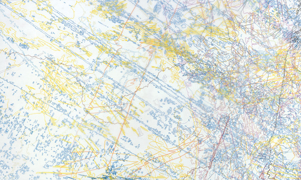
Ingrid Calame, #256 Drawing (Tracings from the Indianapolis Motor Speedway and the L.A. River), 2007. Color pencil on trace Mylar, 48 x 72 in. Courtesy of the artist and James Cohan Gallery, New York.
James Welling: Okay, couple of things, just to establish. These drawings are all one-to-one scale in size.
Ingrid Calame: Yeah.
JW: And you work by contact. Tracing is a contact medium.
IC: Right.
JW: So you have to be in contact with the original source. How do you get to the second step, making the work, just simple tracing of the original Mylar? This question of transferring data from one transparent sheet to another is what initially got me thinking about your work and its relation to photography. The contact print and negative are the same image size—it’s the idea of the direct copy of something.
IC: Right. When I first started tracing, in 1998, I traced all alone, wouldn’t even let my boyfriend come with me. But as the projects started getting bigger and the tracings more intricate and time-consuming in 2000, I began tracing with assistants. We translate stains into lines that make closed shapes. There’s a subjective aspect to how each person translates a stain, which I like. It opens the process up to other people’s perception within my game.
JW: One of the things I noticed in your studio was the quality of the incredible detail in the Indianapolis Motor Speedway drawings. You said that was because the concrete had an interesting surface that was not visible. But when you were on your hands and knees you could feel it.
IC: The asphalt is diamond cut—they use a special machine to graze the concrete, gravel-like surface down, like a meat cutter on a piece of meat. And that’s what it feels like on your skin! It pulls at the rubber of the tires. When you look at the skid marks closely, they look crystalline.
JW: So it has an incredible “coefficient of friction.”
IC: Yes. Incredible.
JW: To stop the race cars?
IC: And to start. Actually in the pit, where the cars pull in and out to refuel and have their tires changed, the Speedway leaves the rubber there because it gives traction for cars to take off. Everywhere else at the Speedway, they clean the track incessantly so that nothing will impede the cars.
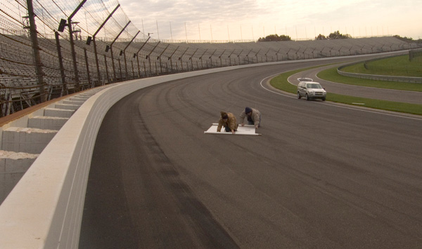
Tracing at the Indianapolis Motor Speedway, 2006. Courtesy of the artist.
JW: But the whole idea of friction is so integral to what you’re drawing, the friction of the pencil on the smooth surface of the paper. And then when it’s translated into the drawings, there’s the slippery surface of the colored pencil on the Mylar. I also noticed that this Indianapolis tracing looks a little bit like a reef or sunken ship, underwater photographs of the Titanic—what’s left after a hundred years of corrosion on metal and wood. Do you ever look at source material like that?
IC: No. I don’t. But connections emerge from things I see in life, just like art references emerge. I noticed that the layers of pit tire marks on this painting reminded me of Gerhard Richter’s squeegee paintings. The marks of the tires, having sped across the Speedway’s gridlike, cheese grater surface, have that squeegee-like loss of continuity in a smooth pulling mark.
JW: So the phenomenon is similar.
IC: Right. And what you were describing about the idea of a reef or a shipwreck, it’s kind of like a cross-section of this information—disintegration to its midsection. The rubber tire mark would be rough when it comes down, but as it takes off again it slices off that last layer of rubber.
JW: Where the rubber meets the road.
IC: Yes.
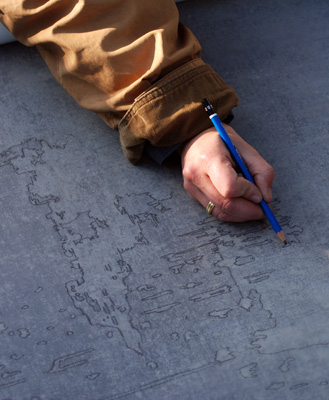
Ingrid Calame at work at the Indianapolis Motor Speedway, 2006. Photo: Tad Fruits. Courtesy of the artist and the Indianapolis Museum of Art, Indianapolis.
JW: But the rubber hitting asphalt is also very similar to a printing press, where a lithographic cylinder hits a piece of paper and leaves an impression. For example, offset printing uses a rubber cylindrical offset plate that’s laying down the ink, like rubber on the surface of the Speedway track. So when I look at your work, I am reminded of graphic arts processes, rubber cylinders hitting paper.
When I was looking at this drawing and these small paintings, they also look like stencils, silkscreen stencils. One of the challenges with silkscreen is that you can’t print continuous tones. Instead it’s all flat tones. Or the issue around reproducing continuous tones in lithography or in silkscreen is to break it up into dots. I know you’re choosing things that are already broken up because of their wear and tear and surface features. This seems related to your need in these drawings to draw continuously bounded shapes. There are no fuzzy edges in your work. Everything is a closed outline. And that’s why I think it has all sorts of adjacencies to offset printing, silkscreen, and photographic processes. There’s no continuous tone. Everything is flat. You use spot colors—planes of color rather than gradations. In most printmaking, one uses transparent dyes or inks. One of the great things about your paintings is they’re totally opaque. You can paint one color over another, and there is never any color bleeding through. Is that because of the paint’s intensity?
IC: Yes, I use sign painter’s paint because of its liquidity. You can see all the marks that I make. But there’s no layering on the actual painting. It’s made like a puzzle.
JW: You mean there aren’t overlays?
IC: Exactly. Each shape is painted, filled in—I wanted it to be like a sign.
JW: Yes. Do you ever look at books on mapmaking? Cartography? Because these paintings also remind me of maps.
IC: Interesting. I love maps, but I don’t aspire to make them. I recently saw a topographic map at Desert Center, and I finally understood what people see in my drawings, because people always say they are like topographical maps. And I saw this map from afar and thought, Wow, yeah, that looks kind of like one of my drawings. But mapmaking is antithetical to my whole process of one-to-one scale. On the other hand, the inspiration for my work is born out of a desire to know the world, which definitely connects it to mapmaking. It’s just that I’m crawling around on the ground, while cartographers are trying to get an overview.
JW: So your work is totally against mapmaking. It’s a map that’s one-to-one. Which would be very difficult to make.
IC: Yes.
JW: You know, when I came in today I thought your work was all about relief. But it’s not only about relief; it’s often about these other sorts of stains. It’s a visual interpretation of the stain through the transparency of the Mylar.
IC: Yes, and it’s topographical too, like with a coffee spill on the sidewalk—the aggregate of the concrete affects how it pools. So there is topography to stains, even if it’s microcosmic. The coffee pools to the bottom of the aggregate, rather than the top of the gravel, and I’m tracing the darker part of the pools. If it were a chunky aggregate, the liquid would pool to the bottom and my tracing would have big circles in it where the liquid pooled away from the pebbles. But if it spills onto a very fine aggregate, the stain looks like a smooth continuous tone, and the tracing is one solid shape.
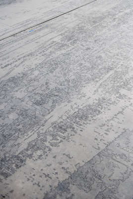
Ingrid Calame, detail of Tracing at the Indianapolis Motor Speedway, 2006. Pencil on trace Mylar, 10 x 40 ft. Photo: Tad Fruits. Courtesy of the artist and the Indianapolis Museum of Art.
JW: So it’s almost like a shadow cast or some sort of a flow pattern. When I was in Austin, Texas, two weeks ago, I was looking at the sidewalk concrete and noticed that it had almost exactly the mixture of stones and aggregate as certain sections of East London, where the galleries are located. Both concretes had medium-sized chunks of rock embedded in this sort of beige, or yellow actually, warmish concrete. And the only difference between Austin, Texas, concrete and London concrete was that in London the concrete guys stamped a grid into the surface. You must look at a lot of concrete.
IC: I do. And I end up moving through different kinds of grounds and stains. I don’t want to trace certain kinds of marks anymore, you know? Certain marks are inspiring at certain times. It was exciting that the concrete at the Speedway was so different from your average asphalt. The concrete, the activity of the area, and the weather, have as much to do with the creation of the marks as the viscosity of the liquid that made the mark. Or tire. Rubber isn’t really a liquid, except when it’s hot. When I was in Buffalo looking for tracing sites for my exhibition at the Albright-Knox Art Gallery I thought of your Buffalo images.
JW: Of the psychiatric hospital?
IC: Yes. We wanted to get access to it because it’s so beautiful and intriguing and mysterious. But we couldn’t.
JW: There were big wings that were closed off. And I remember when I took pictures of it I had to sign a release that I wouldn’t photograph any of the people inside. I can’t believe that I got access to it. I just went up to the front desk and said, “I want to take some pictures.” I guess they understood that it was architecturally important.
IC: Getting access to places is part of the intrigue of doing my work. It isn’t just the drawing and painting, but also all the negotiations out in the world. And going up to the desk and finding out you could just walk in there is part of finding out what the world is about. That’s part of the mapmaking. Rather than being in my studio painting something that is containable here, it’s important to me to negotiate doing a project on the Speedway or in the stock exchange or on the LA River. And then come back into the studio and have the introverted activity of making a painting or drawing.
JW: I think “negotiate” is the operative word for all of your work, from finding the sites to making all the decisions on what lines to trace. The other thing I thought of was the idea of blindness, of the sense of touch rather than sense of sight. It’s a kind of blindness drawing—instead of using your eye; you’re using your tongue to feel the texture of these surfaces. The drawing especially seems as if you’ve dropped this image into a bath of acid, and it’s coming up etched. To go back to the image I had of a boat or wreckage, it’s like the surface of the paper is a layer of water—one plane—and the pencil lines emerge as another raised plane. Your work definitely has a Braille quality to it.
IC: I think surface is something that artists notice a lot. When I look at a painting, I often look at whether it is underpainted—how many layers are there, what hidden history is there to be seen or not? Painting is a document of performance. In an early Philip Guston painting I was surprised to notice that in painting a dog in profile behind a man, Guston didn’t paint the dog’s tail continuing behind the figure even though it emerged on the other side. The painting seemed much more spontaneous than that trail of impasto revealed. That’s a big decision. It gets down to a philosophy of making, a philosophy of visualizing and planning. I wonder how you think about that when you make a print.
JW: I’m always looking for ways to extend the surface of photography. I never feel I am able to do it very successfully, so I like looking at people who have. In a couple of older photographic processes you can see quick relief layers of gelatin. In Polaroid photographs you also have a kind of a relief situation, as well as in carbon prints. I remember a Paul Outerbridge photograph at the Getty, with different surfaces and kinds of reflectivity, and he’s painted back into the picture with inks to darken certain things. It’s a very hands-on material photograph. Ink-jet prints and gelatin silver prints are really different, and I like both surfaces. But still there’s almost not enough surface for me in photography, so I have to imagine that there’s more surface there. I think the important ideas for me in your work are this idea of mapping, negotiating, and then blindness.
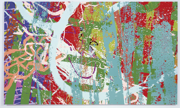
Ingrid Calame, #258 Drawing (Tracings from the Indianapolis Motor Speedway and the L.A. River), 2007. Enamel paint on aluminum, 6 x 10 ft. Courtesy of the Indianapolis Museum of Art, and the Carmen and Mark Holeman Contemporary Fund.
IC: Mapping like nonmapping?
JW: Like the impossibility of mapping—the idea that you are mapping the world, but at a one-to-one scale, and the futility of that process. It’s negotiation because it’s all about visual interpretation of the stains through the transparency of the Mylar. It’s really mediated. It’s not a rubbing. You’re looking through something, so it’s a kind of very primitive perspective. It’s not just this idea of transferring things from one surface to another; it’s a negotiation and a decision-making process in the hand of the draftsperson.
IC: Rubbings are really beautiful, but they are too tactile for my project. I like the tracing being a translation into a highly graphic image. That’s why I use a line, because a line is like a word. A line is based on writing. There’s a semiotics of line and drawing. And there’s legibility to my translations of gray mass “shadow” into line. I’m interested in the relationship between representation and abstraction. So this tracing is a representation, it’s like a word I’ve written of what this tire mark would be. This is my word for it. And there’s legibility to the entire gesture through the accumulation of these tiny parts of the image. On the other hand, all the tracings are abstract because they do not naturally begin and end. I’m defining the edge of the grayness; I’m deciding what is negative and positive at once. Drawing is like language to me. Language is the most representational thing. When I’m doing the trace drawing outside, I record the stain, which is representational. The further away I get from that first tracing of the ground, when I use the tracing in my model of representation, the more it becomes an abstraction. The link of the tracing to the street is both representational and abstract. Just like words are abstractions, yet we continually rely upon language’s ability to describe images and experience, to be representational.
JW: And one of the ways you learn to write is you trace. And you trace letters.
IC: That’s true.
JW: And you could take all these traced sheets of paper back to the site and line them up. But the connection between drawing, legibility, and writing is important for you. The idea of tracing, copying, of repeating and representing is, if not language, like language. It’s like a very primitive language, where a word stands for a thing, and you’re just peeling the language off of the thing, or the lines away from the object, and then we look at them with all their ghostly negative space. The issue of negative space is the other thing that’s really remarkable, especially in these dense Indianapolis Motor Speedway drawings. There is no negative space. It’s hard to tell what’s positive and what’s negative. There are so many little floating elements. Of course there were floating elements in your earlier work too.
IC: Yeah, but it’s gotten a lot more complicated. And I’m amazed when people helping me trace can follow what they are tracing, because you always have to remember what’s positive and negative. Otherwise you end up with little lines floating out there. Tracing is very zen, actually. You have to pay attention to the moment, but you have to pay attention to the whole and its parts at the same time.