white-wall white
by Travis Diehl
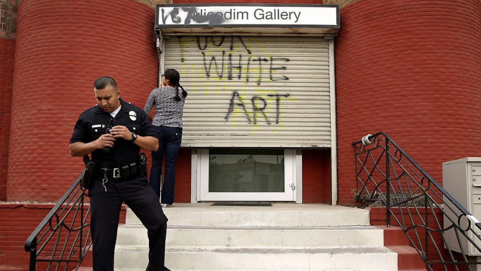
Graffiti sprayed across the entrance of Nicodim Gallery in Boyle Heights, 2016, photo: Liz O. Baylen, Los Angeles Times
Perhaps we ought to think of painting as a ghetto waiting to be gentrified.
—Walead Beshty, “The Whiteness of the Whale”1
High on the smog-softened masonry of a vacant mill tower, caught between an overheated sunset and a tropical sea, a polar bear stretches an admonishing paw.2 Kim West painted this lonesome scene in 2011, when the new tenant of the complex once known as “The Graffiti Building” invited several artists to spruce up the densely tagged exterior walls with fresh, sanctioned murals.3 Years later, in late 2015, the troubled bear would become one of the few survivors of the former flour mill’s purchase and restoration by global commercial art enterprise Hauser Wirth & Schimmel (HWS) when the gallery commissioned West to expand her piece across half of the mill’s east elevation. By the time the gallery held its grand opening in March 2016, a melted Northwestern coast of bleeding emerald greens and watery blues spilled down the east alley wall onto an ochre tussle of Lascaux-style wildebeests. In the bottom-right corner of the wall is West’s signature.
Thus Hauser Wirth & Schimmel groomed the grit of its L.A. home.4 This newest branch of Swiss gallery Hauser & Wirth declares the city’s place on the global art circuit: “Their new commitment to our renowned contemporary art scene is just the latest piece of LA’s cultural renaissance,” remarked mayor Eric Garcetti, “positioning us squarely at the heart of international creativity.” Yet HWS also tries to equivocate its specific, local presence in a trending neighborhood. The centerpiece of the relentless and near-total gentrification of an arts district that has priced out artists, the gallery nonetheless courts a transitional downtown vibe. Murals like West’s expanded commission offer a sanitized, curated version of the tags and murals that HWS allowed to remain elsewhere on their building.5 For example, in the same alley as West’s piece, spanning the entire outer wall of the east gallery, is a 2010 mural by Out for Action Krew titled One Fallen Angel—an angel-winged woman peers across the jagged, metallic letters of “LOS ANGELES,” frayed into pot-leaf patterns and crowned by a silhouetted L.A. skyline.6 Bracketed by these two murals, between the east gallery and mill tower is Hauser Wirth & Schimmel’s public garden, which, as of this writing, features picnic tables, chickens in a pen, and raised beds of flowers and herbs for the gallery’s “farm-to-table” restaurant, Manuela. Chipped brick walls and other extant murals provide urban ambiance—a small preserve for the more unruly Arts District of 2010 and before, now largely erased.7
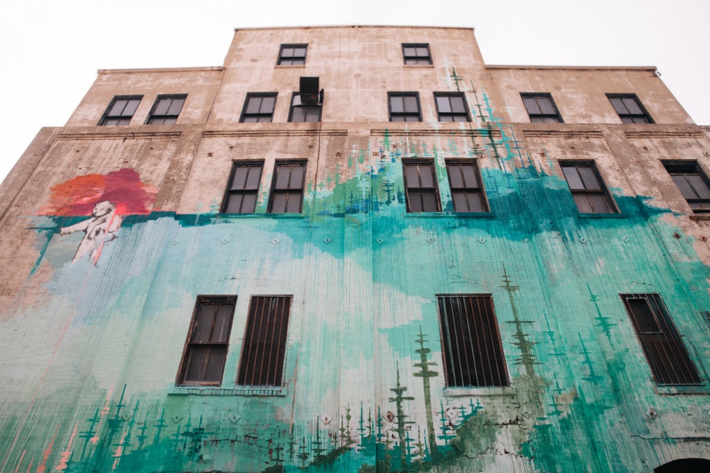
Kim West’s extended mural on the east facade of Hauser & Wirth, photo: Liz Kuball, New York Times
The other three faces of the complex, however, received paint jobs of a more austere order. Along 2nd St. to the north, the loading docks on Garey St. to the west, and the main entrance on 3rd St. to the south, HWS wears shades of heather and white trimmed with battleship gray; the prominent mill tower, save West’s decoration and the lower part of the garden face, beams an unqualified white. The HWS website links the building’s past uses to its present; walls that were once white are white again:
If the mill tower was the heart of the facility and the engine of industry on this site, the neoclassical bank building facing East 3rd Street was the grand facade, welcoming customers into the soaring sky-lit arcade that is now the South Gallery of Hauser Wirth & Schimmel; its institutional architecture signalled [sic] an economic and cultural commitment to the public. … In the 1970s, with light industry moving out of downtown and the Los Angeles businesses decentralizing, the expansive spaces of the district’s abandoned factories attracted artists and musicians who reappropriated the area and ignited its transformation from a dangerous and desolate place to a hub for creative industries.8
In the slide from industrial industry to creative industry, the white facade of the neoclassical bank building serves the gallery as it did the mill: as a sign of “economic and cultural commitment to the public.” The mill tower, now private viewing rooms and studios, remains the facility’s heart.
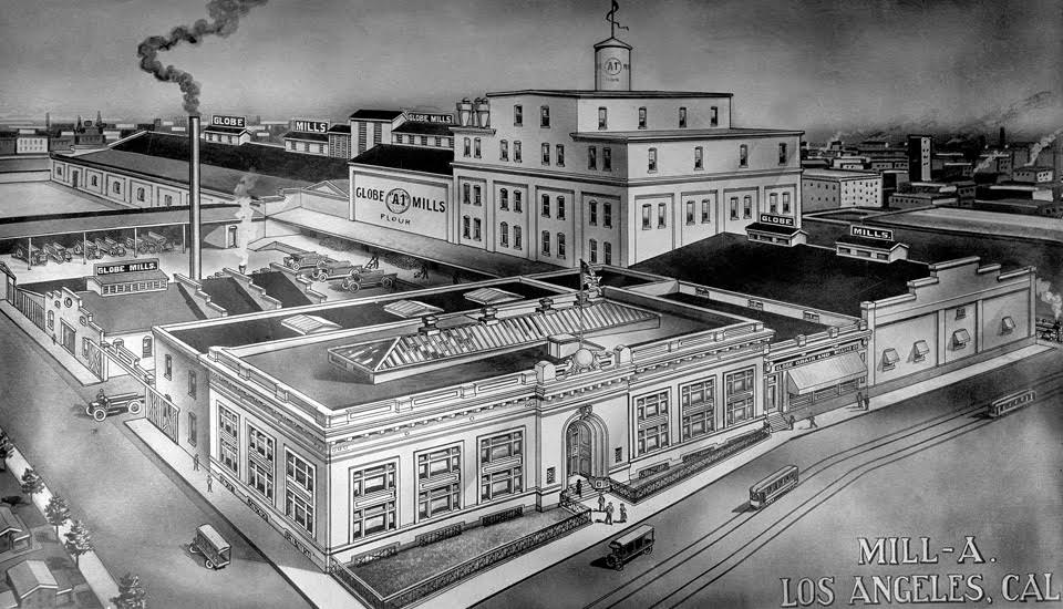
Drawing of Globe Grain and Milling Company, Los Angeles Public Library Photo Collection
Hauser Wirth & Schimmel’s use of murals contributes to a strategic, and somewhat confusing, conflation of private business and public building. “Nor can we forget,” writes Brian O’Doherty in Inside the White Cube, distinguishing the easel painting from the wall it hangs on, “that the whole thing is suspended or supported—transferrable, mobile currency.”9 HWS’s appeal to this dichotomy continues inside their compound, with two artworks by gallery artists visible from the most publically accessible node of their private commercial venture: the Manuela restaurant. Across from the host’s station, on a new buildout adjacent the courtyard, is a fresh blue-and-black abstract mural by Mary Heilmann (Pacific Ocean, 2016)—a wall painting by an artist known for more fungible work.10Within eyeshot, hanging on an unfinished brick wall above a few restaurant tables, is When the Hilltop Gets Heavy (2016), an idiomatic canvas by Mark Bradford, where layers resembling peeling paint and billboards are scuffed into a quasi-abstract map of Los Angeles. The mural is known as a public form and the canvas a private one. Yet the Bradford, an owned and transferrable object, speaks the language of an urban commons. In the Heilmann, meanwhile, the color and composition of insular, abstract neomodernism are presented as a communal experience.
Regardless of what money changes hands, a mural seems to make a civic contribution without the market motives that haunt easel painting.11 Perhaps a mural was painted for free, or, like West’s 2011 phase, at the artist’s own expense—or, purest of all, illegally. The white neoclassical facade is the institutional diplomacy of the 20th century; the official Arts District mural is the tote-bag populism of the 21st. In between the extremes of old-school graffiti and blue-chip painting, West’s 2015 commission brokered the transition between a “dangerous and desolate place” and the reified preserve of high culture—between Street Art and Fine. Against the easel picture’s commercial ambition and ownability, the immobile, imminently visible mural seems to boast an innate formal force: the mural’s value is imbricated in that of the wall it adorns. “Indeed,” writes O’Doherty, “murals project ambiguous and wandering vectors with which the spectator attempts to align himself.”12 The canvas is displaced; the mural displaces.
And where this negotiation with the public no longer suits the tenant, one can always wipe to white. The HWS website features an elevated night shot of the complex from the southwest, where the white bank-building facade and white mill tower align. Thus pictured, the industrial character of the gallery’s cacophony of sloped-roofed sheds and tiered offices is reaffirmed within a grid of similar rehabilitated structures—yet the HWS building alone glows a preternatural white: a beacon of culture both nested within, and held apart from, the surrounding city. A similar but sunlit shot of the gallery on the “Mission Statement” section of their website reiterates this contrast. HWS frame their compound from a perspective the average visitor will never have. Street-level contingencies give way to the gallery’s airy vision of itself—less a built building than a rendering of buildings to come.
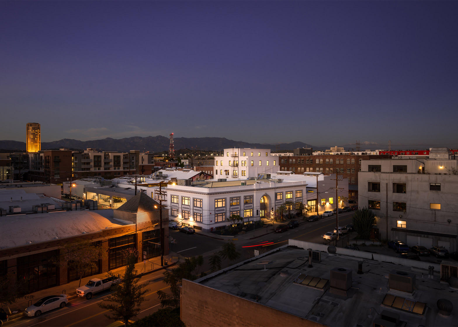
Exterior view of Hauser & Wirth at 901 East 3rd Street, Los Angeles, photo: Joshua Targownik
If the autonomy signaled by the white cube has been more or less debunked and re-embedded, the white interior wall remains the default ideology of art display. No wonder galleries, artists, and activists all struggle to articulate the ideology of the white exterior. Art has moved from inside the white cube to beyond it, yet has failed to reckon with their interface: the white cube’s exterior. The white facade retains what O’Doherty describes as the ghostly, “limbolike” quality of the white cube—an otherworldliness, or art-worldliness, seemingly disconnected from the contradictions of normal life.13 The wall presents as solid white, through and through; a homogenous art substrate. Indeed, the white building is not passively set apart, but actively signals its atemporality, its unearthliness, its sitedness not within brick-and-mortar urbanism but an imaginary, even spiritual realm. Just as the “neutral” wall supports the freighted canvas—just as the artwork in the white cube depends on the image-making, irreal any-place of its surroundings—the white exterior is made to bear the projections of art.
Between the 2011 and 2015 phases of West’s mural, the earnest transfiguration of the Arts District jumped the river into the historically diverse Jewish and Latino working-class neighborhood of Boyle Heights. In 2013, 356 Mission (a gallery backed by New York art dealer Gavin Brown) and the Ooga Booga art bookstore opened in an unadorned warehouse at 356 S. Mission Road. In 2015, Maccarone, another LA outpost of a New York dealer, opened on the next block. The two buildings are structurally similar, two-story frontages with vaulted warehouses; they even share a landlord. But it was the latter space that first attracted the ire of local activists. One night in November of 2015, two months after the opening of Maccarone’s inaugural show, students from a nearby charter high school mounted an event they called “Ambularte” to protest the accelerating gentrification of Boyle Heights.14 The group set up booths in front of the gallery, displayed paintings by local artists, and offered a screen-printing station for agitprop in the style of Warhol’s soup cans while a projector beamed slogans onto the gallery’s facade. Without physically attacking the walls themselves, the activists nonetheless made Maccarone’s walls the contested site. Indeed, the rhetoric of both galleries’ walls is perhaps why one was passed over, and the other targeted.15 While 356 S. Mission Rd.’s galleries largely retain their raw feel, Maccarone hired an architect to redesign the interior, which is painted down to the rafters in glowing white. Neither space significantly altered their buildings’ exterior; 356 Mission kept its grimy beige brick, yet Maccarone had only to refresh, edged in forest green, the existing white coat.
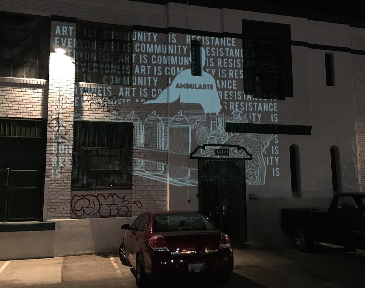
“Ambularte” exhibition projected onto the walls of Maccarone Gallery, 2015, photo: Abe Ahn, Hyperallergic
In early 2016 PSSST, a new residency, performance space, and gallery—with a varied and quasi-public mission statement that read much like that of Hauser Wirth & Schimmel—opened on East 3rd Street, a five-minute walk from Maccarone and 356 Mission.16 Unlike its neighbors, PSSST was, in fact, a nonprofit. Its press release stated a commitment to openness, inclusiveness, and community dialogue.17 Its well-connected board was remarkably diverse, with many members drawn from POC and queer communities. Yet none of this could quite overcome the statement made by the building itself: a narrow warehouse on an industrial lot, renovated and redesigned by an architect to resemble something less like a community gallery than a displaced/displacing condo. On the night PSSST was scheduled to open its first show to the public, its new gate stayed shut. Instead of gallery goers, a group of protesters gathered outside: they’d made PSSST the last stop for an anti-gentrification rally.18 A few activists projected slogans and criticisms onto the bricks of an adjacent building. Others moved a section of cyclone fence in front of the gallery, hung with signs and banners. It was, though, the most abstract, nonverbal expression that made the clearest point: feces flung at the gallery’s white facade.19
you say protesters threw feces at your building, but you know what else they did? they projected necessary fucking art and turned the outside of your building into a living canvas filled with life and anger and made art, and you woke up the next morning and called it disruption and feces.20
The white building, despite its tacit claims to the contrary, is a woefully physical, temporal, and vendible piece of the city. The white wall is the outer limit of art’s self-contained rhetoric; the interface where art breaks down and gets lost—and where the anti-gentrification activists first found their purchase.
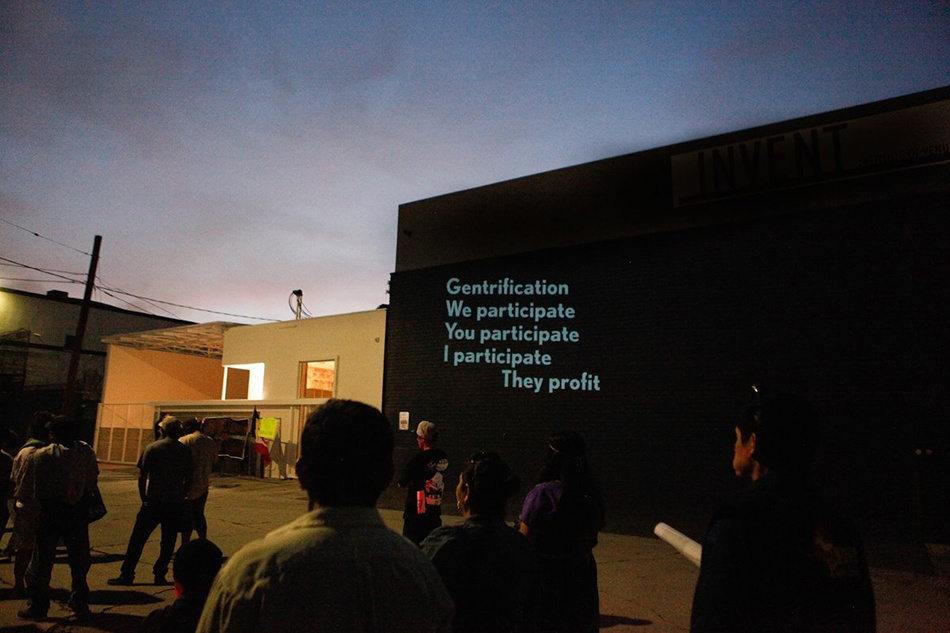
Protesters projecting anti-gentrification messages outside of PSSST, 2016, photo: Heather M. O’Brien / KCET
PSSST, avowedly eager to engage the Boyle Heights community, closed less than a year after opening, citing the difficulty of courting donors in the face of public censure.21 Over a dozen galleries now operate in the district, and the demonstrations have grown. Indeed, our typology wants clarification: the white wall is not always painted white. In November 2016, it was the brick red Nicodim Gallery that received an unknown tagger’s unalloyed sentiment on its rollup gate: “FUCK WHITE ART.”22 The cream-colored 356 Mission is now the target of occasional protests. In February 2017, members of the Boyle Heights Alliance Against Artwashing and Displacement (BHAAAD) picketed a meeting of the Artists’ Political Action Network held at the gallery; at a subsequent opening, protesters handed out fliers equating 356 Mission and Donald Trump.23 It remains to specify that “white art” is not necessarily about the race, class, or creed of the artists and gallerists, but the art’s perceived ideology. Never mind that PSSST embraced the rhetoric of intersectionality and class struggle, that the staff of 356 Mission Rd. have punk and DIY roots,24 or that Nicodim’s founder fled Communist Romania—or that, when Nicodim Gallery was graffiti’d, the show inside was by a Chinese artist. One representative from the anti-gentrification group Defend Boyle Heights put it plainly: white art is commercial art.25 White art is made to sell.
It follows that, at least where art is concerned, the solution to white art is art made without commercial ambition; art that won’t be, can’t be, sold or sold out; art that serves the community—that is to say murals, whether rendered in acrylic, spray paint, or thrown feces. (Indeed, when Defend Boyle Heights posted the “FUCK WHITE ART” graffiti on their Instagram, they credited an “Unknown Artist” from “Boyle Heights, CA,” and noted date and materials—2016, “Graffiti on Metal Door.”) Yet the mural, too, is subject to a purity test; even a brightly painted wall might conceal the ideology of the white cube.26 When Nicodim Gallery’s neighbor, Venus Over Los Angeles, opened in 2015, it sported pink walls and a cheerful mural of fruit by Katherine Bernhardt; yet the protesters have not passed that gallery by.27 The same seems true of galleries’ politics: Even where their intentions may be progressive, or at worst naïve, and while their websites and programming may declare their idealism, their buildings nonetheless suggest the white cube’s darker purpose—namely, real-estate speculation of a privileged kind. “Exclusive audience, rare objects difficult to comprehend,” writes Brian O’Doherty—“here we have a social, financial, and intellectual snobbery which models (and at its worst parodies) our system of limited production, our modes of assigning value, our social habits at large. Never was a space, designed to accommodate the prejudices and enhance the self-image of the upper middle classes, so efficiently codified.”28 White-wall white remains the image of transaction and possession. Murals or no, the whiteness of the walls seeps through.
Hauser Wirth & Schimmel seems to realize better than most (or perhaps has more resources to realize) that the gallery’s rhetoric starts with its exterior. The refurbished warehouse is itself an architectural feature that, like the “neoclassical facade” of HWS, makes symbolic street-level contact with the public. The HWS murals, both new and preserved, are as much a whitewashing as the gallery’s refinished factory frontage. For their part, BHAAAD and associates use an activist rhetoric that paints all galleries in the district as agents of the same gentrifying, even racist, force, then demand they do nothing less than move out. The problem of commerce, i.e. possession, i.e. whiteness, seems intractable. Less sensational than late 2016’s “FUCK WHITE ART,” but a better summary of the ultimatum facing both galleries and activists alike in this “transitional” zone, is an early 2017 tag spray painted on a rollup gate at Venus Over Los Angeles: “HATE IT OR LOVE IT.”
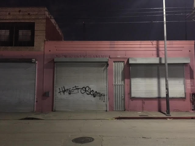
Venus Over Los Angeles gallery, 2017, photo: Travis Diehl
The hard questions O’Doherty posed in 1976 frame the Boyle Heights debate forty years later: “Is the artist who accepts the gallery space conforming with the social order? Is discomfort with the gallery discomfort with art’s etiolated role, its cooption and vagabond status as a refuge for homeless fantasies and narcissistic formalisms?”29 We have clearly moved beyond O’Doherty’s ideology of the gallery space to the ideology of the gallery—that is, an art ideology detached from space. Yet, as quasi-public spaces, art galleries don’t have the luxury of an abstract autonomy. Nor do they have the option to hide in plain sight behind a post-industrial veneer. This much is demonstrated by Hauser Wirth & Schimmel. If its embrace of urban integration on the exterior seems at odds with an essentially private mission, this is because it is selling art with the populist rhetoric of a building built to sell bread. White walls won’t do. Especially not when the mural, too, has been incorporated into art’s suffusive substance. For an architecture of the truly dispossessed, we should look beyond the gallery. Start at 3rd St. in Boyle Heights at the former PSSST. Follow the road a couple blocks westward, pick it up on the Arts District side of the river, go a few blocks past HWS, and you’re in Skid Row. At the corner of 3rd and Los Angeles St. is one of the walls that serve the homeless as open-air latrines: a width of white cinderblocks, decked with Pollock splatter and Newman zips in a rainbow of greens and browns.